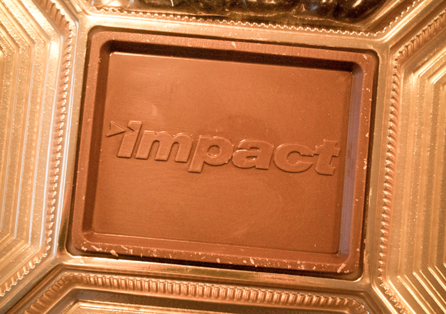
“Ok, but does it also work in chocolate?”
One of the key tenets of NewFoundry’s approach to visual identity design is the concept of elasticity. What we mean is that the final design of your visual identity will be flexible and adaptable enough to work well in any medium, and exploit the specific opportunities and limitations of each medium. Simply stated, no matter where you put your logo, it will be awesome.
We typically start our design process with the simplest, purest expression of the identity which is black on white. No gradients, shadows, or any visual tricks or trendy gimmicks allowed, just one-color simplicity. Once we feel confident here, we move on to the standard exploration of four-color process, PMS colors, CMYK vs RGB, and a host of color combos. Then we determine if it holds up in all sizes: will it work large and isolated on a billboard, tiny on a 16 x 16 px favicon, or something lo-res like a fax cover sheet. (Hey, you never know. You might still need one.) This is all fairly common best practices design.
But at NewFoundry that’s only the beginning. We don’t stop until we’ve determined that you can embroider it on a shirt, you can stamp it in metal, and you can deconstruct the elements to make an amazing app icon. We make sure that whatever design concept we present it’s going to work for your brand for long into the future. And yes, every once in awhile we get to find out if the mark can still hold up in chocolate.
We offer our heart-felt thanks to our client Impact Products for their holiday gift to us, and for their willingness to take their new identity to delicious new places.