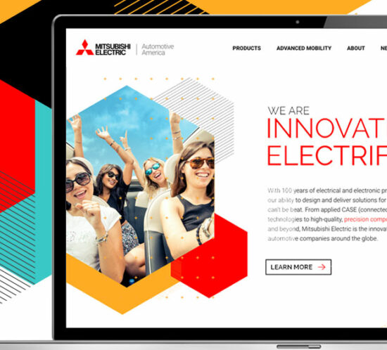
Mitsubishi Electric Automotive America
A bold new brand identity and website showcases a heritage automotive supplier’s strengths in innovation
![]()
RESULTS:
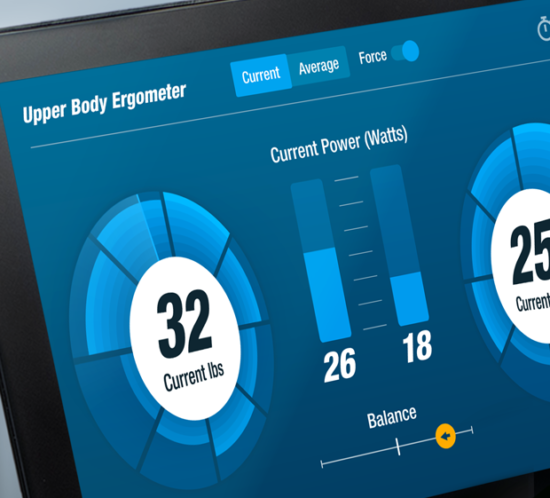
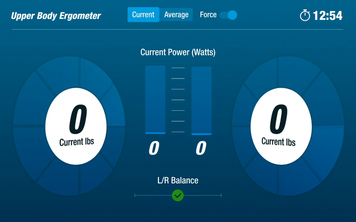
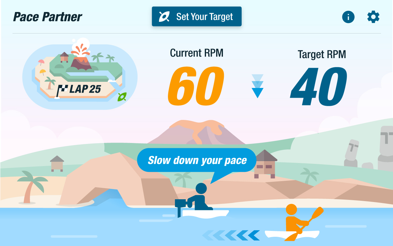
Mitsubishi Electric Automotive America (MEAA) is a Tier 1 supplier to the automotive industry that specializes in mobility solutions such as autonomous-ready connected infotainment and ADAS solutions, high-definition displays, and more. Headquartered in southeast Michigan and with five satellite offices throughout the US, MEAA is an affiliate company of global powerhouse brand Mitsubishi Electric Corporation. Crafting a distinctive, relevant brand presence, identity, and voice as an automotive supplier has proved challenging for many in the marketplace; achieving that while staying true to an expansive corporate brand adds an extra layer to the challenge. MEAA sought NewFoundry’s expertise in brand identity development to solve its positioning and messaging puzzle, then bring the new strategy to life with a new brand system showcased first as an all-new flagship website.
Inspired by stakeholder interviews and other findings from our discovery process, we sought to craft a positioning statement and messaging strategy that pays homage to Mitsubishi Electric’s 100-year history of innovation in electrical and electronic products and systems. After exploring and vetting several possible directions, we landed on a headline and supporting copy concept that would serve to inspire the bold, new brand system created by our design team.
We are innovation, electrified.
Electronic products are our past and our future. In fact, we’ve been igniting the automotive industry for 100 years. And with the arrival of the modern mobility age, we’re just getting started. From advanced automotive technology to the highest quality components and user-centered solutions, we were made for this. We are Mitsubishi Electric. We are innovation, electrified.
Working closely with stakeholders at MEAA, our strategists and UX designers established discrete goals, user personas, and user stories to drive the design of the new website. Over the course of several weekly design and engineering sprints, the new website came together as the dynamic, engaging experience that all of us envisioned from the start.
The result is a website that flawlessly showcases the evolving world of innovations at MEAA, captures the attention of automotive manufacturers, partners, and content creators, and serves as a crucial conduit for lead generation and talent acquisition.
Experience MEAA’s bold new stance for yourself at https://www.meaa-mea.com/.
PROCESS AND DELIVERABLES:
 RESULTS: